Conservation Northwest
Branding | Rebrand
MY ROLE: Research, Visual Design, Layout, Copywriting, and Web design.
TOOLS: Illustrator, InDesign, Photoshop,
and After effects.
TIMEFRAME: 11 weeks
TEAMMATE: Elise Harper
BACKGROUND:
Conservation Northwest was founded in Bellingham in 1989 and is the leading voice for conserving wildlands and connecting native wildlife to natural habitats from the Washington Coast to the British Columbia Rockies.
PROBLEM:
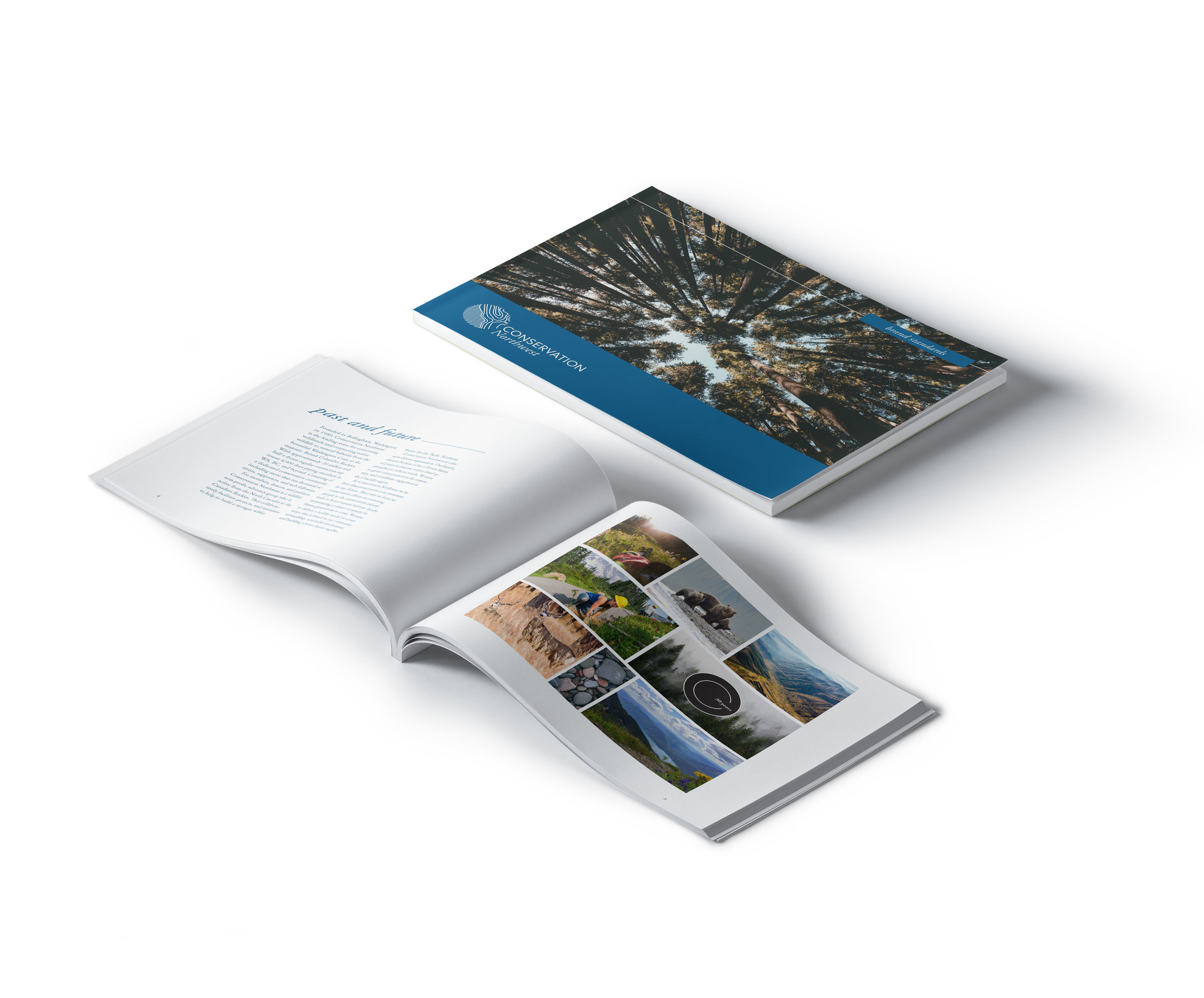
To celebrate their 30 year anniversary they were in need of a brand refresh that highlights the 30 years of dedication demonstrated by the volunteers and members of Conservation Northwest.
SOLUTION:
Create a brand to elevate Conservation Northwest’s Dedicated, Purposeful, and collaborative mission. The new Conservation Northwest identity is derived from the 30 years of collaborative work done with the well being of the region and future generations in mind.
PROCESS:
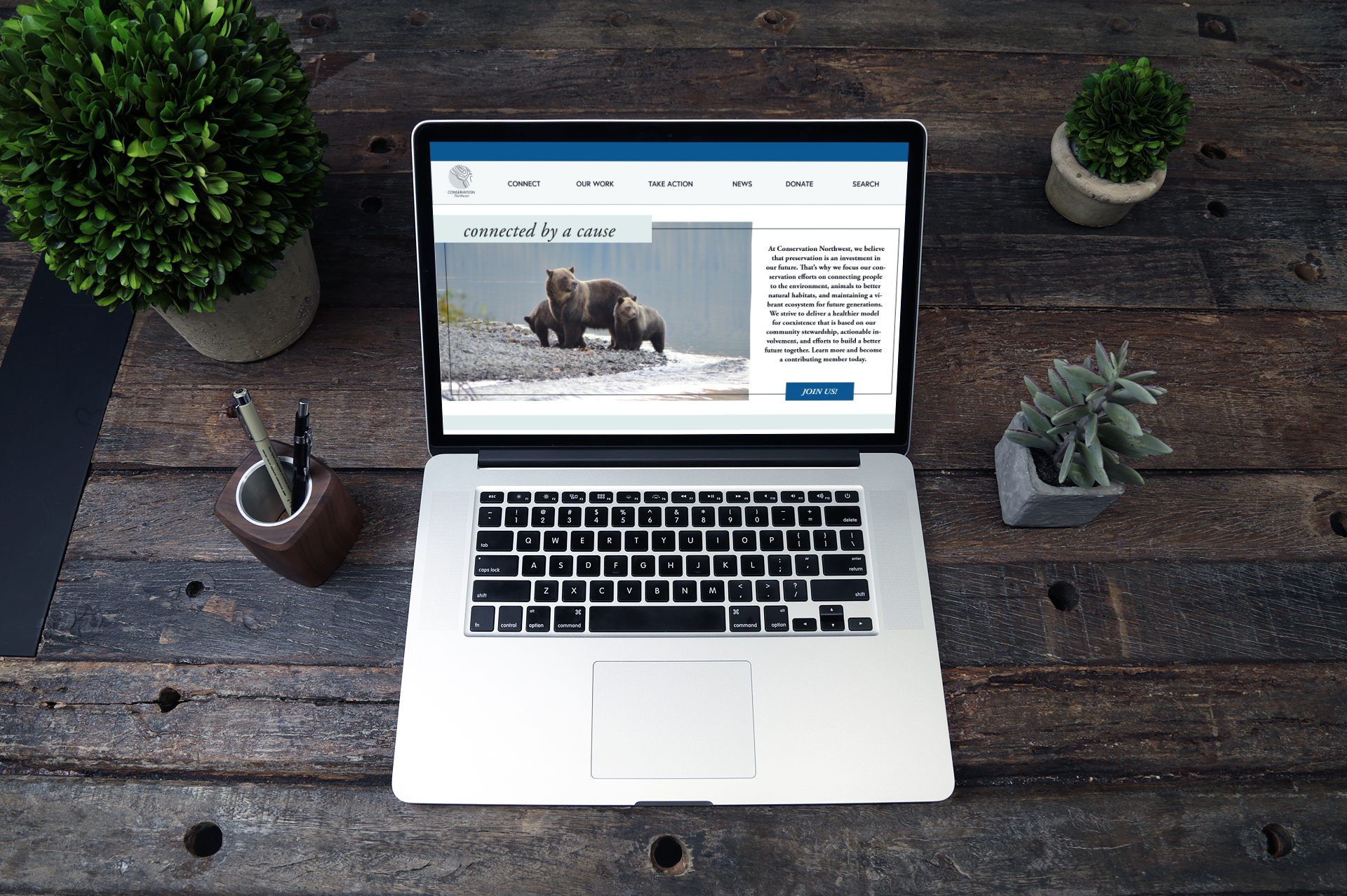
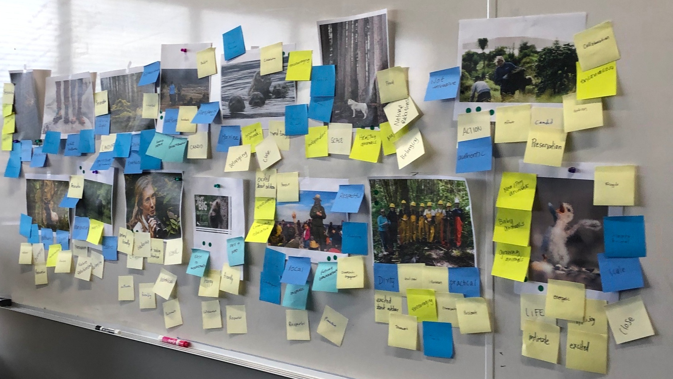
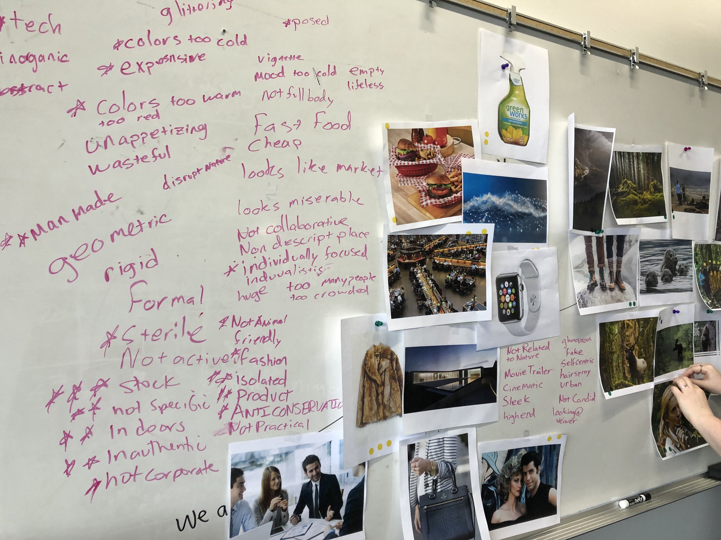
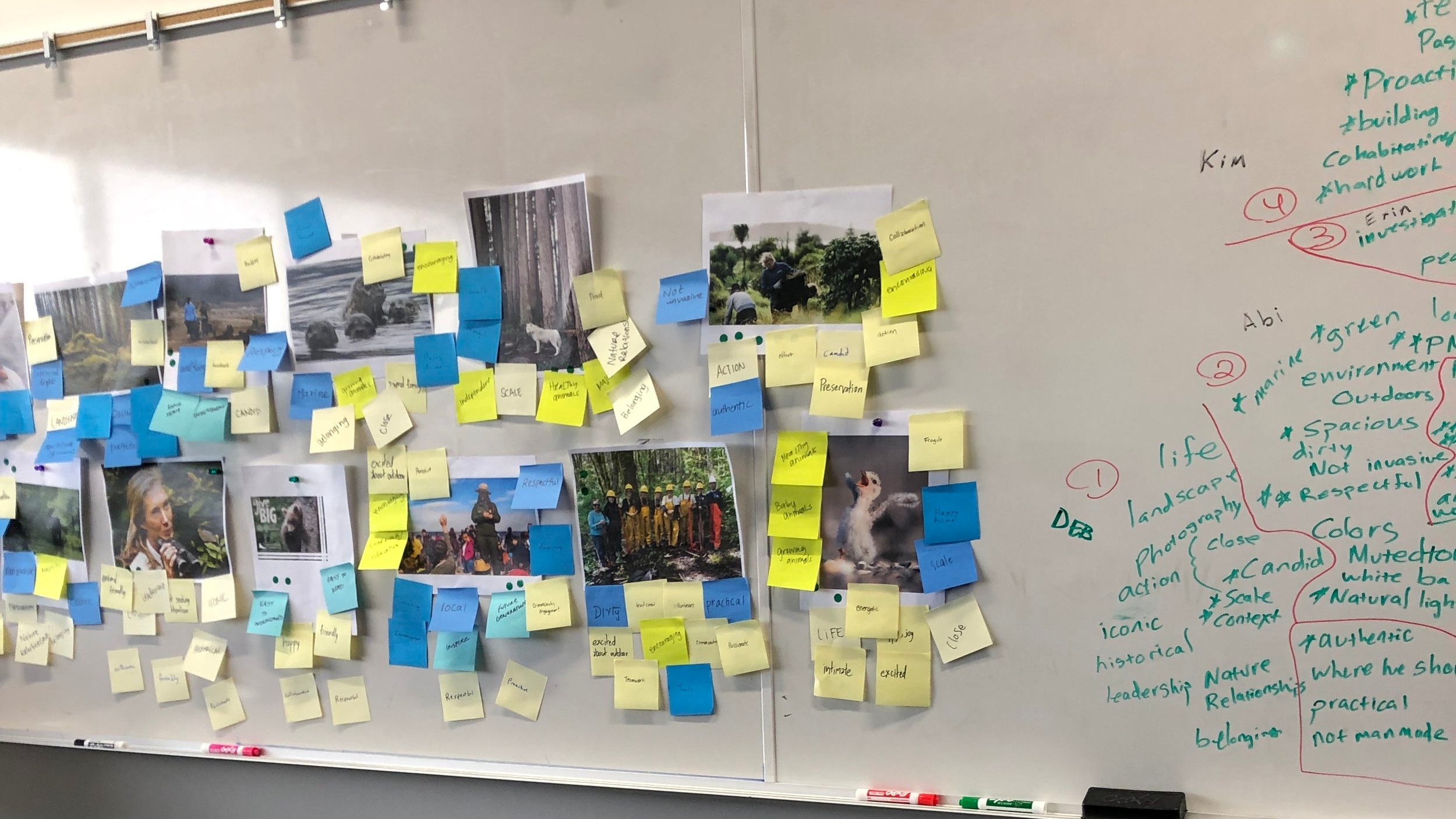
Elise and I began by researching Conservation Northwest’s 30-year history. After researching the existing brand we narrowed our focus with the keywords collaborative, dedicated and purposeful. From here we created keyword specific mood boards in order to develop a refreshed brand strategy. “Connected by a Cause.” From here we moved forward creating assets and collateral that the brand could use right away to inspire members and future conservationists.


THE CONCEPT:
As a mission-driven organization, Conservation Northwest focuses their efforts on connecting people to the environment, animals to better natural habitats, and maintaining a vibrant ecosystem for future generations. We identified that the work needed to preserve the environment can feel larger than a small group of people can accomplish. The concept “connected by a cause” was born from the need to gather a dedicated network of eco-conscious people and inspire them to carry out this important work together.

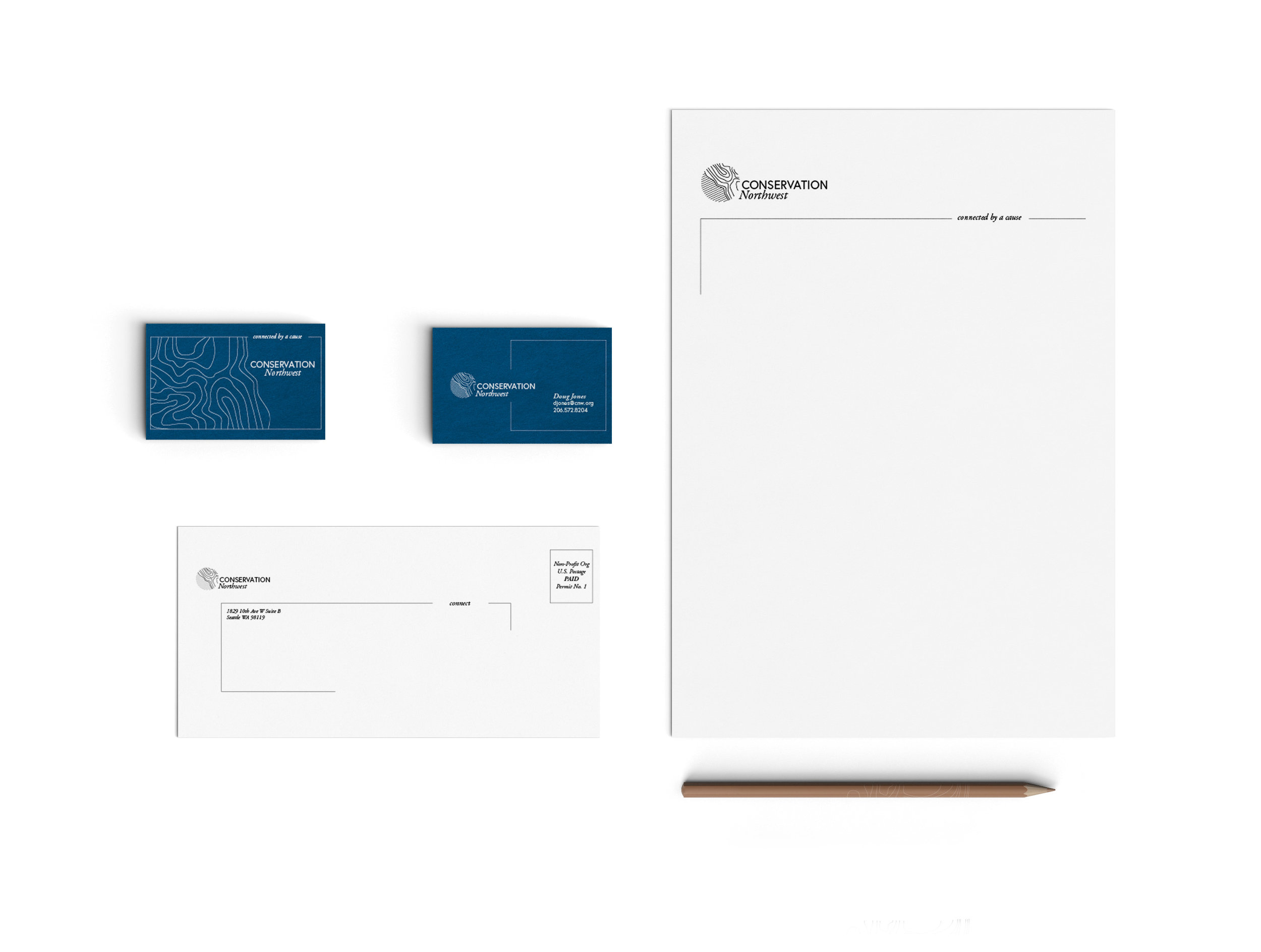
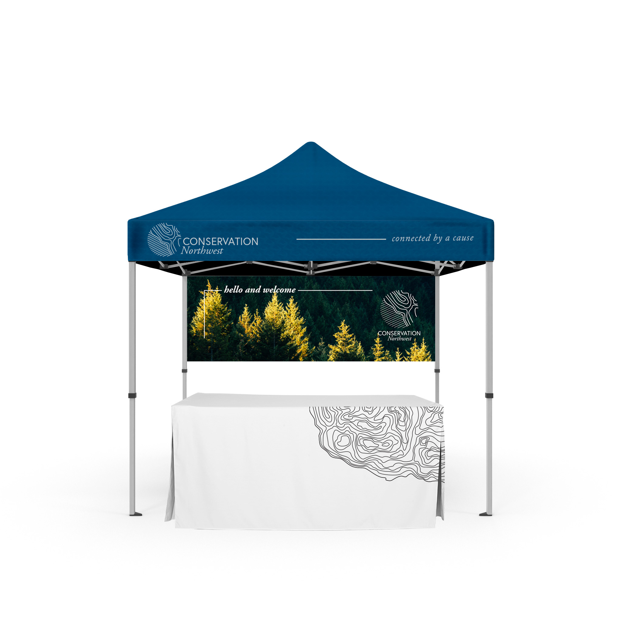
THE BRAND :
We drew inspiration from our mood board that was built with the epic landscapes and open spaces in the Pacific Northwest and lead our campaign with a full color true to life photography. Organic concentric lines purposeful ruled lines and patterns connect the brand to its mission. Additionally, we introduced a color palate that is rich with trusted blues but minimal enough to stand out from the typical or expected color choices seen in environmental organizations.


LOGO:
We spent weeks developing our brand mark by sourcing ideas from our mood board. After iterating and refining we settled on a logo. The logo created for Conservation Northwest represents two different elements coming together. There is room to interpret this in two ways; resources of land and water we see in the Pacific Northwest region or the coming together of communities focusing on environmental conservation working in tandem.

BRAND TOUCHPOINTS: